

Overview
The outer styling (any containers around fields, etc) is completely in your control. Secure Fields also generates classes along with a set of data attributes and attaches them to the outer<iframe> containers, so they can be targeted
with custom CSS. Finally, an object of CSS rules can be passed to the
addCardNumberField, addExpiryDateField, addSecurityCodeField and addField methods
options to style elements inside the frames.
Usage
To customize a field, pass an Object containing some Options Any options override the defaults.Options
Placeholder
A placeholder text for the field can be added as a string.Pattern
A pattern the field value should match can be added as a string (regular expression). This only applies to the postal code field.Max length
A maximum length for the field value can be added as a number. This only applies to the postal code field.Styles
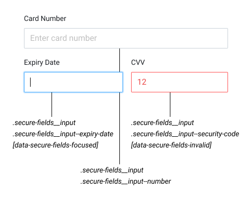
Each secure input is wrapped with a div, which can be targeted with custom CSS using the following selectors:styles Object this way:
- Base styles are declared by setting keys in
camelCaseformat (PascalCasefor vendor-prefixed properties) and values as strings - Hover, focus and other states are declared by setting keys to
:[state](for example:hover) and values as objects containing base styles
Logos
A scheme logo can be displayed to the customer as part of the user experience. This is possible by listening to thecardNumberField and displaying the appropriate scheme logo.
Refer to payment_method.scheme for the full list of schemes.
The logos can be loaded via https://cdn.<gr4vy_id>.gr4vy.app/assets/icons/card-schemes/<scheme>.svg
Refer to card scheme definitions for more
information around the schemes and logos.